


Anderson
Publication Design
Typographic Design
Publication Design
Typographic Design
The Anderson Chapter explores the use of typographic elements used in Wes Anderson films. This chapter is a part of a larger book about the history of typographic design in cinema. This work is an exploration of book layout and typographic features within publication design.
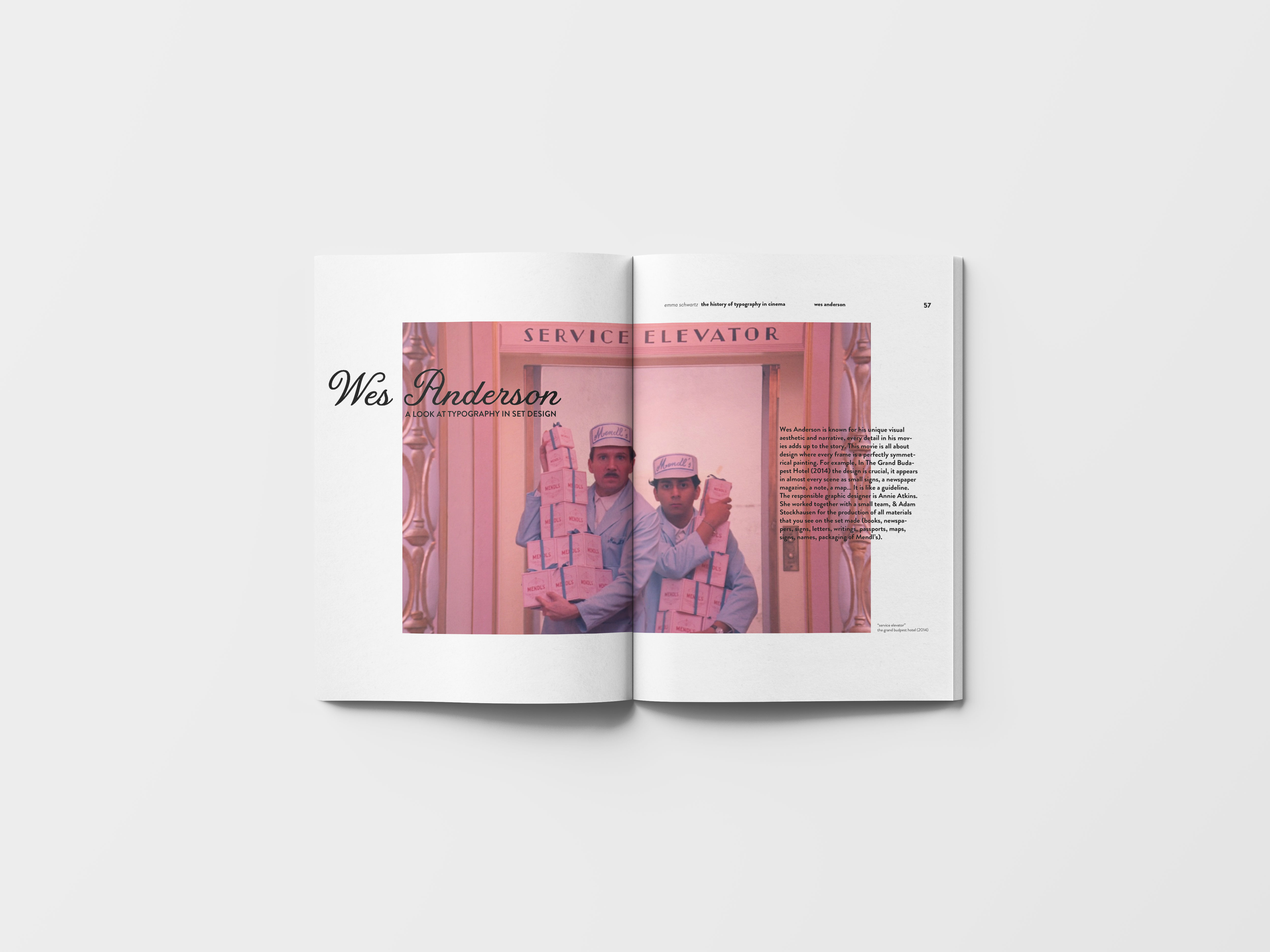
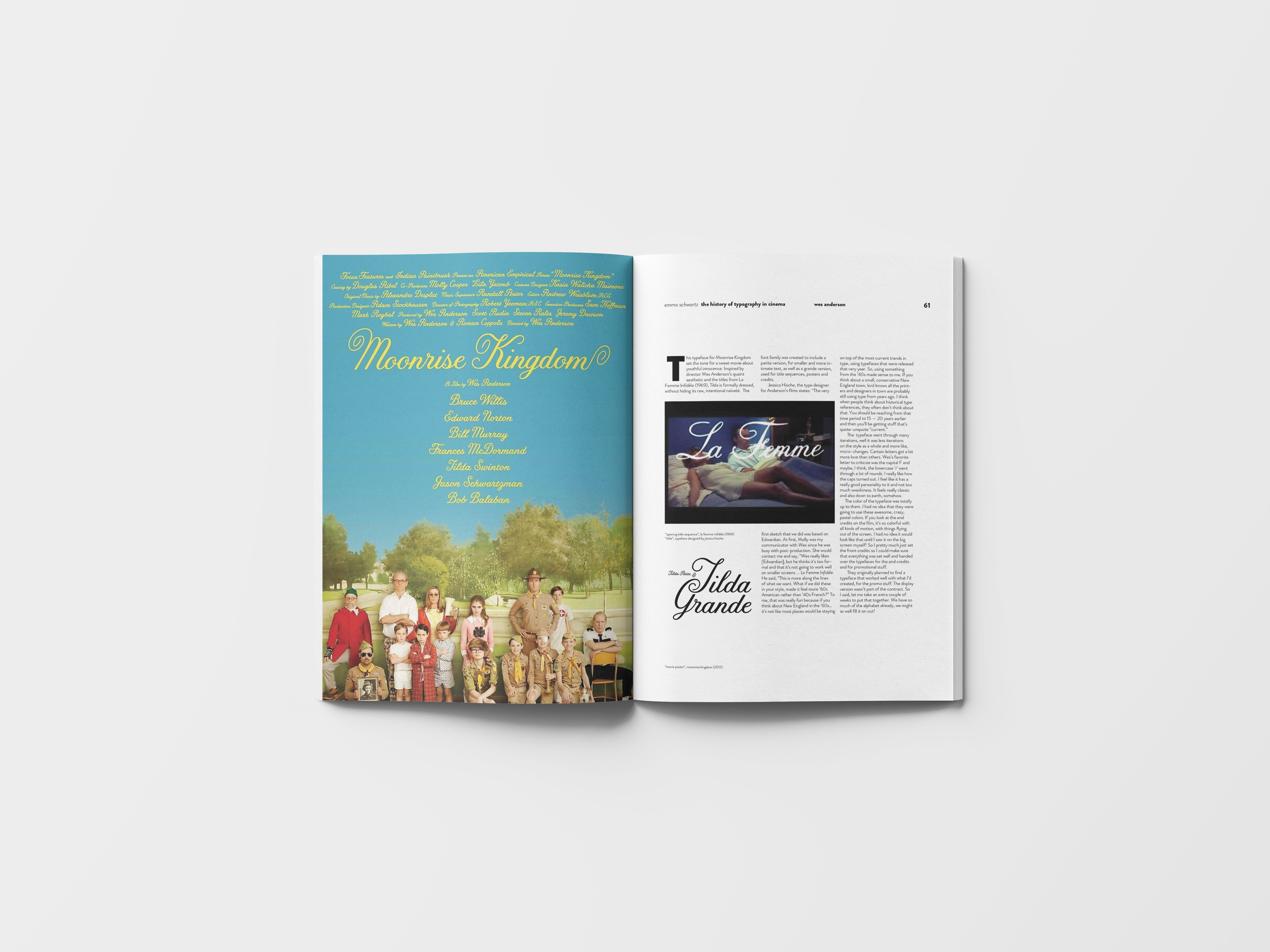
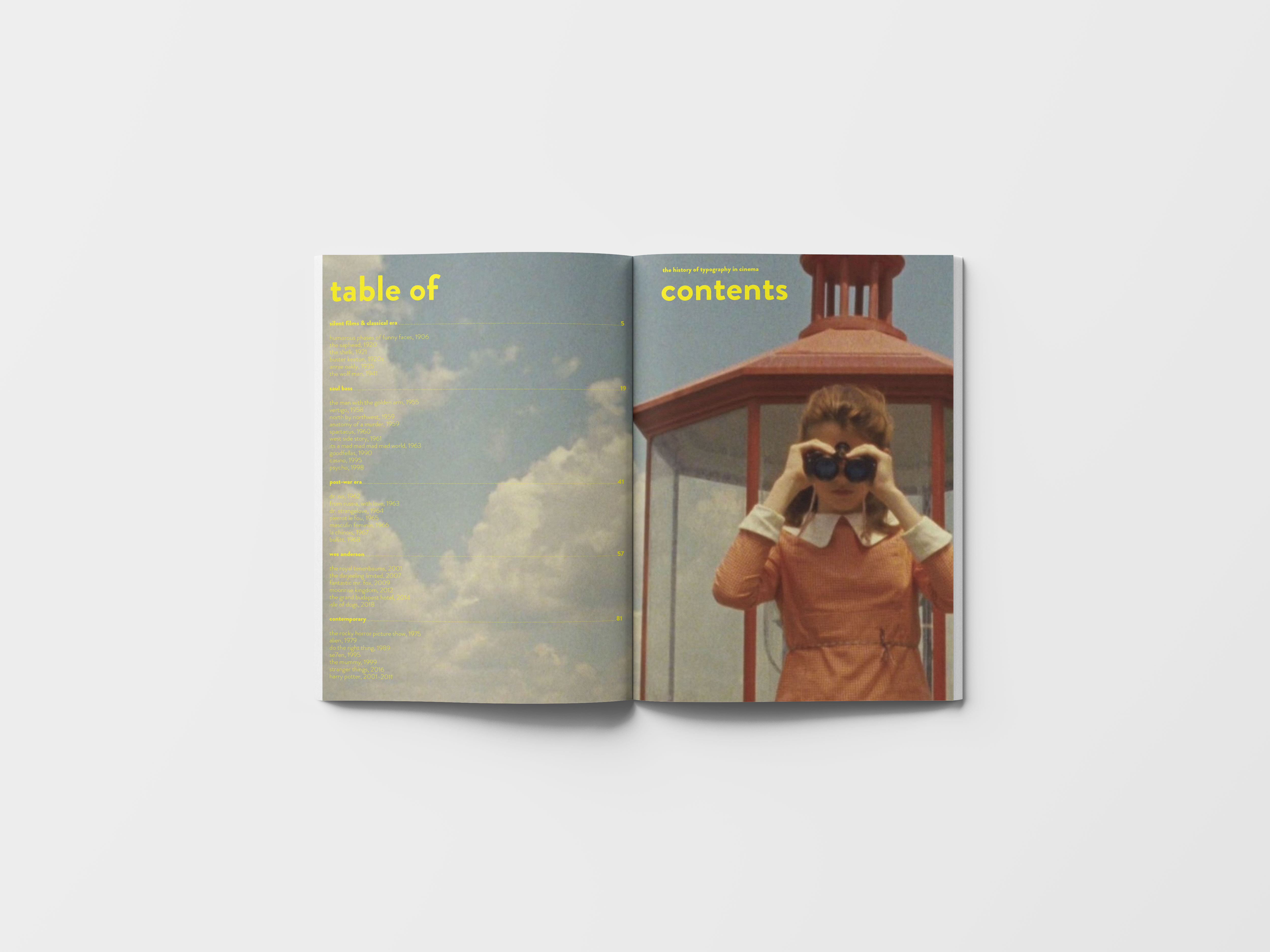
I chose to focus on Wes Anderson’s use of typography in his films. This is an iconic example of the explicit use of typographic features within cinema. I focused on balance within the spread. I also chose bold, yet soft, colors to complement Anderson’s use of color. This chapter shows examples of an opening spread, an image-heavy spread, and a text-heavy spread. The table of contents uses a similar closing credits format, paired with a screengrab from Anderson’s film Moonrise Kingdom of the main character Suzie using binoculars, referencing the act of searching which a table of contents is used for.
I also designed a cover for this book. The cover nods to Jean-Luc Goddard, and his iconic use of “i” within his films. I kept my cover a simple black, with the title in a square, referencing silent film intertitles.